Slate
Blackcurrant
Watermelon
Strawberry
Orange
Banana
Apple
Emerald
Chocolate
Marble
Slate
Blackcurrant
Watermelon
Strawberry
Orange
Banana
Apple
Emerald
Chocolate
Marble
Leaderboard
.thumb.jpg.41cf7a4ece0ad136e727c0e0c2e2f423.jpg)

Popular Content
Showing content with the highest reputation on 07/23/20 in all areas
-
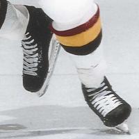
2 pointsLooks like Doughty started skipping the top eyelet in March 2008 and added the shot blockers in April 2012.
-
2 pointsHe does go tongue under. If you search him on GettyImages and sort by oldest first you’ll see he was lacing loosely to the top until partway into his rookie season in the NHL and then started skipping the top eyelets. He continued with that setup for a while before adding the shot blockers. My guess is it was the best way to add protection to an otherwise prone area, since he had a few inches of ankle protected only by the skates’ tongues, while avoiding adding too much bulk, since mobility has always been one of his key assets. Speculating further, maybe he lets the top of the shot blocker flap out to avoid messing with his forward flex. I’ve tried a lot of different tongues in my skates and have surprisingly found that tongue stiffness is one of the most important factors to how a skate feels and responds. My preference is for the softest tongue possible if the boot has any stiffness at all. My Graf 701s have minimal stiffness, so they pair better with a stiffer 703 tongue.
-
1 pointHas anyone seen an article regarding players who may/likely be made available at expansion draft time? I haven’t come across any
-
1 pointOh, how I hope that catches on.
-
1 pointI'm leaning towards the Leafs because I think younger legs will handle the layoff better. This and the CGY-WPG series are the two I'm really looking forward to.
-
1 pointAnd the thing is, Alexandar Georgiev is a stud too. A true embarrassment of riches.
-
1 pointhttps://news.sportslogos.net/2020/07/23/nhls-new-seattle-kraken-announce-name-logos/
-
1 pointHe also runs short tongues and no socks. Got to see the team practice a few years back in NJ. Looked like the tongues are short enough to not really need to be tucked under.
-
1 pointAfter all this time, they can't release the name, and have apparel to sell on the same day? Fanatics has zip, "Coming Soon"
-
1 pointYou mean it's not the Krak-House?
-
1 pointThe lines at the bottom is a bit unbalanced vs the arm bands. Could have used a bit of a wave there too maybe, or maybe it was a bit too much. The shoulder logos are a bit uninspired, could have maybe used a "K" in there or in the logo maybe. Or maybe even spell out the name somewhere. The Main logo itself looks good, I love the tentacle incorporated in, love the ferocity that it conveys. EDIT: Ok I will recant my judgement on the shoulder logos, it's much nicer when I saw the detailed work incorporating the Space Needle. https://www.icethetics.com/news/release-the-kraken-seattles-nhl-team-finally-has-name But the Wordmark is troublesome because I'm not sure if the first K is a capital or not in that font. Seeing as it's different from the 2nd K, it must be but there are not enough distinction between the two.
-
1 pointI like the logo but agree with the color scheme. I just like how they incorporated Seattle and Kraken within the 'S' itself. Not overly complicated but does it good job with doing so. Similar to the Flyers' logo.
-
1 pointI'm not a huge fan of the logo. Like the name though, but I feel like they could have done way better on the logo. The S is clearly a nod to the history, but it also would be way better as a shoulder logo. The colors are... fine, I guess. I hated the Vegas color scheme when it was unveiled too, and now it's actually one of my favorites. So who knows.
-
1 pointI really like the logo. Let's get back to hockey boys!
-
1 pointAnnouncement starting at 9AM: https://www.youtube.com/watch?v=WPH2uxwvSZI
-
1 pointLooks like he does skip the top eyelets, with shot blocker on top.
-
1 pointHey Steve, Have you guys ever considered a discount for bulk grinding rings purchases? For example, you offer the (3) ring starter pack for a discount. I’d like to stock up on 1/2” and 5/8” wheels for the season and it would be nice to see a price break at some point. If I weren’t all set on 1/2” Fire wheels, I would just buy starter packs. Thanks.
-
1 pointI learned hockey outside on roller blades, and only played on asphalt with a ball from middle school until intramurals in college. Before quarantine, I hadn’t skated outside in 12 years, and hadn’t purchased outdoors wheels in 15. Was fun to set up bearing and wheels again! I used to be SUPER comfortable on roller blades, and I’m kinda back, but haven’t regained stopping. I used to be able to more or less “hockey stop” on roller blades or do that power slide. Now, I just do hard turns and pray to break speed. I took a page from Vet88 and have been skating with my laces undone. Not sure if it will translate to ice at all. We’ll see!
-
0 pointsAs someone who lived in Seattle for a long while I must admit I am disappointed in the team and arena name.