Slate
Blackcurrant
Watermelon
Strawberry
Orange
Banana
Apple
Emerald
Chocolate
Marble
Slate
Blackcurrant
Watermelon
Strawberry
Orange
Banana
Apple
Emerald
Chocolate
Marble


Hills
-
Content Count
1389 -
Joined
-
Last visited
-
Days Won
56 -
Feedback
0%
Everything posted by Hills
-
@dkmiller3356 why the LS2?
-
Order has been officially placed... And I was told 4 weeks from payment date. Which is a total of 7 now so that is annoying but I believe the 1st 3 weeks was a retailer issue... But I'm looking forward to solving my goalie skate issues!
-
This team always does that! We may get destroyed 7-1 but we look good doing it!
-
Thanks haha, I still think it looks weird but I can see out of it fine so it seems to be my go-to now. Got some pictures of the pads and mask together!
-
Yup, and I had to tie slack in them after the game last night, pad didn't rotate back enough.
-
Since my custom pads are delayed even more... I was luckily sent a demo set to try out. With no bootstrap or standard toe ties this experiment should be interesting.
-
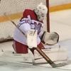
Finally got it! And the obligatory awful self photo.
-
New skates! Trying to get away from the foot pain I always had in my Vapors. Also, didn't notice until I uploaded it how blurry the photo was so my bad.
-
Those are so ugly and awful I am tempted to do those colours when I order mine.
-
They aren't gimmicks just because you can't utilize them because you don't fit into the skate. They are legitimate features other brands don't have. While Bauer gets bashed a lot, their goalie skates are pretty great at a retail level if they fit. Problem is that people like me don't fit into them, but I will be disappointed that the True skate I buy doesn't have some of those features in the 1S or 1X.
-
To be fair, the goalie 1S are totally different from the player 1S. VH feel much closer between the two than Bauer does.
-
In my defense, when both of my teams have a playoff weekend I become dead tired and end up looking worse in photos than normal... Nice to win the league though after starting 0-5-1.
-
I tried it once with the Ultra Tacks as I have the knee sleeves for goalie. But they pushed the shin guard way too far off my knee because of the shallowness.
-
I wish more pants had padding there. I was looking into buying a pair of these for goalie and another pair for player, but the knee padding is too thick for my liking to go under my goalie knee pads and my shin pads. After seeing this happen I'll never say anything to anyone who wants more padding in the thighs. It wasn't like that was a blocked shot either, just in the wrong place by someone who can't aim at pickup.
-
Thanks for filming me falling over!
-
I wonder if this is a 1 year thing to go to the Olympics. He seemed to still have enough in him to keep playing and being productive.
-
Or just make sure you don't play with dicks... Haha
-
Did you edit that on the plane? That was fast!
-
Sher-wood BPM090 85 Flex PP05 LI Thank you to Sher-wood for sending me this BPM090 stick for review. This review was slightly different than most, the point of this was to compare a price point stick (in this case the BPM090) in my prefered specs compared to a clearance top end stick where you have to take whatever curve and flex pattern is still left on the wall. This stick was also to be used by my teammates to get feedback from them and compare it to their plethora of clearance and price point sticks. I also must apologize for this review not coming out sooner, I gave it to my teammates to pass around and needless to say I didn’t get it back for a few months. Stick History: Sherwood 9950 Wood Coffey, Bauer Supreme (Sport Chek SMU) Kane, Sherwood T70 Stastny, Winwell GX8, Easton RS Parise, Warrior AK27 , Warrior DT1LT Pavelski, Warrior DT1ST Grandlund, Verbero PM44, Sherwood Rekker EK60 PP26,Warrior Covert QRL W03, CCM Ribcor Trigger P29, Sher-wood BPM090 PP05 Stick Info: Weight: 485 grams Grip: Yes Shaft: Gloss, rounded corners with flat sidewalls (Sher-wood states double concave but they feel completely flat to the touch) Length: 60 inches Usage: 7 months Price: $110 Canadian Grip: Until last year I was never a fan of grip sticks, but since the majority of sticks today come with grip I have gotten used to them and even enjoy certain types (specifically my Warrior Covert QRL and CCM Ribcor Trigger, both of which have raised textures along with a grip finish). The Sher-wood BPM090 doesn’t have any raised texture along the shaft, in fact the grip doesn’t go all the way up the shaft. The majority of grip sticks I have used stop the grip coating close to the blade of the stick and that is no different with this BPM090, the unique part of this Sher-wood is that just above the flex and curve detailing the grip coating stops and the top of the shaft is just paint. Now I am assuming the idea of this is that the grip is covered by stick tape or a stick grip, but if you are someone that wants a grip stick and you don’t use a lot of tape on your top hand this stick might not work for you. The grip coating is fairly tacky and on par with my Warrior Covert QRL and CCM Ribcor Trigger. The grip itself isn’t anything unique or special on this Sher-wood BPM090, I much prefer grip sticks with the raised texture and I’d prefer this stick to feel like the matte non-grip that my Sher-wood EK60 had. 7/10 Aesthetics: I enjoy colourful designs and accents, but I feel Sher-wood made a mistake with the BPM series of sticks, especially considering how understated and classy the T120 looked. But perhaps I am biased as the black with red and gold accents with exposed carbon fibre reminded me of the last generation of Lotus F1 cars. There are certain aspects of the design on the BPM family of sticks that I actually really like, the contrasting colours look great with each other and the BPM detailing found on the bottom of the stick looks good as well. Sher-wood no longer pays the NHL feels to have their logos visible on gloves or sticks, the result was Sher-wood cleverly adding details to the paddle and shaft of their goalie sticks with team specific colours. While not immediately obvious of the branding, keen eyed viewers instantly know what type of stick is being used even without the company's brand visible. Going back to another Formula 1 reference, this type of design happens in other sports were certain brand can no longer advertise. In this case the cigarette company Marlboro who used to be a primary sponsor for Ferrari racing teams. Thanks to reddit user TheTrueSurge, Marlboro never really left Ferrari racing and still sponsors the team today just without their “logo”. I feel like Sher-wood does an excellent job with this branding, and while the design isn’t as funny as the famous “Allen Wood” stick I would prefer if Sher-wood went to a similar branding route with their retail hockey stick offerings. The BPM150 has exposed carbon fibre on the blade up to the bottom of the shaft as well as at the very top of the shaft. But the rest of the shaft is painted in the BPM yellow and navy blue which is a far cry from the exposed carbon design on the previous T120 sticks. I believe this is a case of too much colour and paint, the BPM150 stick is also heavier than the outgoing model (paint isn’t weightless). Sher-wood’s use of contrasting colours along with exposed carbon fibre work well with the Rekker EK60 line and I wish the BPM followed that pattern with the BPM series. This BPM090 stick is slightly more disappointing than the BPM150 as the entire BPM090 stick is painted. While I understand the need to differentiate between the top end stick and their price point sticks (I mentioned this in my Warrior QRL review), the Rekker EK40 still had an exposed carbon blade and the older T90 sticks have plenty of exposed carbon fibre throughout the blade and shaft. I have no problems with the colours that were chosen for the BPM stick lines, but rather the execution and overuseage of paint. 6/10 Curve: When I usually review curves I start off with “I like heel curves” as a qualifier to state that I am managing with what I can get. Happily that is not the case with the curve on this Sher-wood BPM090. Listed as PP05 LI is a heel curve with a squared toe and I absolutely love it. The PP05 plays similar to me as my beloved Warrior W05 curve, short saucer passes and chips are easier than ever for me with this curve while my shots are more controlled and less aggressive. I have an easier time keeping slap shots and snapshots low from the point whereas I have to concentrate on keeping my P29 and W03 curves down below the waist. Another bonus with the heel curve is being able to utilize your back hand. With a toe curve making backhand passes, shots or clearings is an act of precision. With toe curves the puck has a tendency to slide off the blade if you aren’t careful when on your backhand, with heel curves you can start the puck on a wider range of positions on the blade and the puck won’t roll off causing you to fan on the puck. The downsides to this curve is that you have to work harder to raise the puck, especially when in close, but overall I feel I am able to do more with this curve where I have to do the work compared to trying to tame and control the more aggressive curves. Keep in mind this pattern works well for my play style, but it might not if you are more of a offensive sniper. 10/10 Blade: The Sher-wood BPM090 uses a Sher-wood’s VRF.2 blade, the same blade can be found on the higher priced BPM150 and the Rekker EK60. Since this blade performs the same as the EK60 I reviewed I am going to take some snippets from there. The blade in this Sherwood feels extremely firm and stiff since the day I got it. The VRF.2 blade has not gotten softer or felt like it has started to break down. I enjoy firmer feeling blades as the pingy feel make them great for puck feedback allowing me to know exactly where the puck is. I have never felt a pass that a puck bounced off of the blade when I believe I should’ve been able to corral it, something that was an issue with me when using softer blades. With the VRF.2 I have never felt the blade open up or flex when taking a shot, but the one downside to a stiffer blade is you do feel vibrations and force when receiving hard passes and taking slapshots. The only downside I have with the VRF.2 blade is that it feels slightly thicker than the blade on my Warrior QRL, which makes getting under a puck slightly more difficult and makes the Sher-wood blade feel a tiny bit softer than the one found on the QRL. 8.5/10 Feel: With a stiff VRF.2 blade, I can feel the puck better when stickhandling. But because of the weight of price point sticks the Sher-wood BPM090 felt cumbersome in my hands. If you aren’t used to using a stick in the low 400 grams (or less in the case of Sher-woods EK60) this might not be as much of a shock to you, but for me it felt like going from a lightweight precision tool to a heavier and more blunt object. I constantly found my hands lagging behind what my mind wanted to do because of the extra weight. This is very noticeable when trying to bat pucks out of the air or poke pucks away from the other team, while the weight isn’t a huge issue stickhandling I still felt I was slightly lagging behind what I have become accustomed too. The stiffness plays close to advertised and this 85 flex BPM090 feels similar to my 85 flex CCM Ribcor Trigger and my other 85 flex sticks. 5/10 Stickhandling: I love the lively and stiff blade that is on the Sher-wood BPM090 for stickhandling. Like I mentioned before I feel the stiff blade relates the position of the puck on the blade to my hands quickly. The extra weight of this price point stick does make it feel like my hands are slightly lagging behind what I am used too. The blade is weighted enough so you always know exactly where it is and the extra weight seems to allow me to be stronger on my stick and make it slightly harder to knock my stick away from the puck or for a stick lift. The flatter style heel curve makes toe dragging more difficult but allowed me to pick up pucks along the boards easier. 6/10 Shooting: Sher-wood’s price point sticks (and all of their sticks in general) have had a reputation of punching above their weight and being the best bang for your buck hockey sticks on the market. Since I don’t normally use price point sticks I will have a hard time quantifying that. I wanted to be able to talk about how this stick compares to other price point sticks so I shared the Sher-wood BPM090 to teammates to get their opinions on how the stick played and how it shot. With that said this rating will reflect my personal experiences with the stick, and it will be compared against top end sticks at significantly higher price points. Unfortunately for the BPM090 it is coming against the two best shooting sticks I have ever used (Warrior Covert QRL and CCM Ribcor Trigger). I mentioned earlier that I believe the flex on the Sher-wood sticks are true to their rating, but I feel like flex is hard to measure when stick shoot so differently. I feel this is very evident when comparing this stick and the other two sticks mentioned, while putting effort in bending the stick is similar the shot speed/ease of release are so vastly different you could believe you are using a stick that is too stiff. When you load the BPM090, the result isn’t close to the same kick as top end sticks, and while I wasn’t whiffing shots I never felt I got off the shot I should’ve. While the QRL and Ribcor Trigger and low kick sticks, my experience with high end mid kick sticks confirm my feelings about the release of the BPM090. The price point stick simply doesn’t release as quickly or easily as the top end competitors. When manage to get off a perfect shot with a top end stick the puck feels like it launches off the blade, with my best shots with the BPM090 they feel like an average shot with the $300 sticks. My teammates had slightly different opinions than I did on the shooting ability of the BPM090, they also aren’t directly comparing a price point stick to an elite top end (eg. Easton ST, Sher-wood T90). All of them came back to me saying it felt well balanced but a bit heavy, while their shots felt good but they had to adjust for different length than what they are used to. Facing them as a goalie in warmups they had the same heavy and quality shots they always had, these shooters were talented but not necessarily top end snipers. I never felt that the Sher-wood BPM090 was actively helping my shooting and game. It wasn’t causing me to flub shots but its performance was simply not near the performance of elite top end hockey sticks that usually cost 3 times the price of the BPM090. It wasn’t hindering my play but it wasn’t helping it either. 5/10 Passing: Just like the curve section I usually start this section talking about my preference for heel curves and how I have to adapt or manage with non-heel curve sticks. I was very happy to be back using a heel curve as I am a pass first player. The BPM090’s PP05 allows you to slide the puck off the heel and off the ice allowing you to saucer pass with minimal effort. With heel curves I feel like I can just push the blade forward and the stick does the work for me with the end result being a flat airborne pass. The flatness of the blade and heel curve also allow for easy back hand passes and saucer passes, a play I am hesitant to make with the W03 or P29 curve. For me the heel curve allows me to get off a pass in any stick position without ever having to worry where the puck is located on the blade of the stick. Long cross ice passes were easy to complete with the Sher-wood BPM090, while the heel curve helped the lack of aggressive kick helped here as well. With a shot with an aggressive kick I have found I had to fight the stick to ensure I make a hard pass to a teammate instead of shooting a puck in their general direction, those sticks want to shoot and need to be controlled when making very hard and long passes. Stiff and pingy blades like the VRF.2 can cause hard passes to bounce or jump off the blade when receiving hard passes. Previously I mentioned this blade feels slightly softer than the blade in the QRL and I feel that translated to passing as well, I had an easier time dealing with hard passes with the BPM090 than with the more pingy blade in the QRL 10/10 Durability: This Sher-wood BPM090 has gone through a lot of work, and the paint damage shows that. My teammates are also not the easiest players on sticks, watch any of my gameplay videos and you should see them hacking away. The Sher-wood BPM090 has held up phenomenally with the only visible damage being simply cosmetic. There are no carbon chips or cracks in the blade or shaft. Even with a skate running over the blade there are no cracks. The blade and shaft still play and feel as stiff as they did the day I took it out of the box, and for that Sher-wood should be commended. 10/10 Closing: The scores for the Sher-wood BPM090 are going to look worse than they should. This stick is going up against sticks that cost $320 compared to $110 and the point of using this stick was to see if buying a price point stick in your specs is better than buying a clearance top end stick where you might have to sacrifice your stick preferences (you’ll have to read the other article to see my answer). I feel like the BPM090 did a decent job on the ice, it never hindered my shooting and I never felt like I had to fight the stick to get off a shot. While its weight caused some playability issues I firmly believe it is caused because of my familiarity with the extremely light wight top end hockey sticks. The durability on this stick has been fantastic so far and I have never seen a blade hold up this well before. My teammates, who are more familiar with this price point of sticks, enjoyed their time with it and felt the BPM090 shot as well as or better than their older clearance sticks. One teammate asked me if I would sell it to him, while I don’t sell any gear I get to make a review on, I will happily give it to him and know he’ll continue to enjoy his time with it. 6.5/10 I hope to get my hands on a Sher-wood T120 and T90 stick in the near future so I can compare those highly rated budget conscience sticks to others and try to find the perfect balance of cost and performance.
-
A heads up would be a lot of those retailers have no idea when their True stuff will actually arrive. Do you think it will basically replace skate fitters? That the machine will do a good enough/better job than a semi-knowledgeable skate fitters?
-
The 2 piece... Because it has replaceable parts.
-
How do you find the fit of those? I was going to buy a pair but I find the ring and pinky finger area too loose and too long. I like 15s for the index and middle finger but 14s are too small length wise for those two...
-
Pro Hockey Life should be getting them, so you should be fine finding a fit center then?
-
I think that was a bad call for unsportsman like... that was basically an instant reaction to that. Great diving save right after that though.
-
I get hit in the head almost once a game... So yes haha. After the 1st dent per section they usually don't move much more than that. Always bend in the same spot you posted.